
Introduction
Imagine this. You’re done painting the walls of your kitchen, your master bedroom, and even your children’s bedroom. But you’re still stuck confused as to what color your study room should be.
Your study room is more than just a space to catch up with all the reading you’ve been procrastinating on or the right space to tackle your work calls and more as you work from home. It’s your own sacred space for productivity and learning. The colors you choose for this room can significantly impact your focus, motivation, and in general, your overall efficiency. This comprehensive guide from Nippon Paint delves deep into the world of the best color combinations for your study room, providing detailed insights into the psychological effects of different colors and offering a wide array of captivating color palettes to transform your study space into a hub of knowledge.
The Influence of Colors on Your Productivity
Colors possess a remarkable ability to influence our emotions, thoughts, and actions. In the context of your study room, selecting the right color combination is crucial for creating an environment that fosters concentration, creativity, and motivation.
You might ask us, are you saying I can choose any color I want, make my room look beautiful and still have the best atmosphere for studying? Here’s our answer; well,, technically you can. But it’s always better to understand the psychology of colors in your study room. We recommend you consider the following:
Blue: Blue is often associated with calmness and focus. It has the power to lower heart rates and reduce anxiety levels. Lighter shades of blue, such as sky blue or powder blue, can make a room feel spacious and serene, while deeper blues lend a sense of depth and tranquility. For this, Nippon Paint recommends using Lonesome (NP PB 1481 P) or Grape Gate (NP PB 1490 T)
Green: Green is nature’s color, symbolizing balance and tranquility. It promotes a feeling of refreshment and harmony, making it an ideal choice for a study room. Being surrounded by green can reduce stress and boost creativity. Soothing shades like sage green or mint green work exceptionally well. Check out our Spun Green (NP BGG 1623 T) or Pixie Leaf (NP BGG 1665 T) which we highly recommend.
Yellow: Yellow radiates energy, optimism, and brightness. It can stimulate mental activity and improve memory retention. However, it’s essential to use yellow in moderation to prevent overstimulation. Softer shades like pale yellow or pastel lemon are recommended. You can pick your favorite shade of yellow from our website’s color ranges. However, our expert’s pick for you is Jumping for Joy (NP YO 1127 A)
White: White embodies purity, clarity, and simplicity. It creates a clean, uncluttered atmosphere that can enhance concentration. However, an entirely white room might feel sterile, so it’s often balanced with other colors for a more inviting ambiance. The color Gossamer White (NP OW 1015 P) is our pick for your study room.
Neutral Tones: Neutrals like beige, gray, and taupe serve as versatile backdrops for your study room. They convey a sense of sophistication and can be paired with bolder accent colors to personalize the space to your taste. Nippon Paint has a range of such colors that you can pick from such as Walden White (NP 0W 1010P) and Bare Blush (NP 0W 1023P)
Understanding the psychological effects of these colors can guide you in making informed choices when planning your study room color combination.
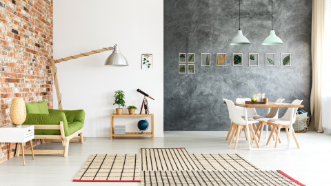
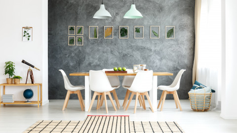
Inspiring Study Room Color Combinations
Now, let’s delve into a selection of meticulously curated study room color combinations, each harnessing the power of colors to stimulate focus, productivity, and creativity:
1. Serene Blue and White
Wall Color: Light blue
Accent Color: White
Why it works: Light blue instills a sense of calm and focus, making it an excellent choice for the primary wall color. Pairing it with crisp white trim, furniture, or shelving creates a clean and refreshing atmosphere that encourages concentration and creativity. This combination evokes the serenity of a clear sky on a calm day, providing an ideal backdrop for scholarly endeavors.
2. Nature-Inspired Green and Beige
Wall Color: Soft green
Accent Color: Beige
Why it works: Soft green brings the tranquility of nature indoors, making it an ideal choice for a study room. It promotes a sense of balance and reduces stress, which can enhance your ability to concentrate. When paired with beige accents, it creates a harmonious and inviting space, reminiscent of a peaceful garden. This combination transports you to the serenity of a lush forest, where the mind can flourish.
3. Energizing Yellow and Gray
Wall Color: Soft yellow
Accent Color: Gray
Why it works: Soft yellow can stimulate creativity and boost mood, making it an excellent choice for a study room where inspiration is key. When balanced with gray accents, it creates a harmonious and motivating environment. The gray provides a stable backdrop for the energizing yellow, preventing overstimulation and maintaining a serene yet vibrant atmosphere. This combination mimics the gentle warmth of sunlight streaming through a curtain of clouds.
4. Modern Gray and Navy
Wall Color: Cool Gray
Accent Color: Navy Blue
Why it works: A cool gray backdrop paired with deep navy accents creates a modern and sophisticated study room. Gray is known for its focus-enhancing properties, making it an ideal primary color for a productive workspace. Navy blue adds depth and elegance to the space, promoting a sense of seriousness and professionalism. This combination sets the stage for academic excellence and thoughtful reflection, resembling the sophistication of a starry night sky.
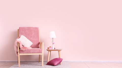
5. Vibrant Red and White
Wall Color: Red
Accent Color: White
Why it works: Red is a high-energy color associated with increased attention and alertness. While it’s a bold choice, using it as an accent wall or in combination with white keeps the room vibrant without being overwhelming. The presence of white helps balance the intensity of red, ensuring it remains an inspiring rather than distracting color. This combination creates an environment charged with passion and determination, mirroring the intensity of a roaring fire.
FREQUENTLY ASKED QUESTIONS:
Is there a wrong way to paint a wall?
While there’s no definitive “wrong” way to paint a wall, certain color choices or combinations may not be suitable for a study room. It’s essential to consider the psychological effects of colors and choose ones that promote focus and productivity.
What color is best for a study room?
The best color for a study room depends on personal preferences and the desired atmosphere. However, colors like blue, green, and soft yellow are generally considered excellent choices as they promote concentration and create a positive learning environment.
Which color is best for a study room according to Vastu?
According to Vastu Shastra, light blue and green are considered auspicious colors for study rooms. These colors are believed to enhance concentration and knowledge retention. However, personal preferences should also be taken into account.
What is the modern study room color combination?
Modern study room color combinations often feature neutral wall colors like gray or beige paired with bold accent colors like navy, red, or yellow. These combinations create a contemporary and stimulating atmosphere, perfect for a modern study or home office.
Incorporating the right study room color combination can make a significant difference in your productivity and learning experience. Remember that personal preferences play a role in choosing colors, so select shades that resonate with you while keeping in mind the psychological impact of your choices. Nippon Paint offers a wide range of paint colors to help you create the perfect study room environment. Experiment with different combinations until you find the one that inspires your focus and enhances your productivity. Transform your study room into a space where learning is not only productive but also enjoyable, where every color evokes the brilliance of your mind.


